When it comes to design, the role of empty space is often underestimated. This space, known as "negative space," plays a crucial part in the art of visual communication. It's not just the absence of content; it's a powerful tool for creating balance, focus, and aesthetics in design. In this blog post, we'll explore the fascinating world of negative space and how you can harness its potential in your creative endeavors.
Defining Negative Space
Negative space, sometimes referred to as "white space," is the unmarked, blank area surrounding and within design elements. It's the breathing room that exists between objects, typography, or images. While it's technically "empty," its impact is far from void.
The Power of Balance
One of the key roles of negative space in design is achieving balance. It allows the eye to rest, preventing overcrowding and chaos. When used effectively, negative space can create a harmonious and aesthetically pleasing composition.
Focusing Attention
Negative space can act as a spotlight, directing the viewer's attention to the most critical elements of your design. By surrounding an essential object or message with negative space, you make it stand out, ensuring that it's the first thing the audience sees.
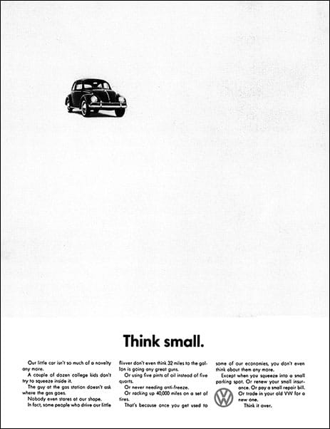
Creating Depth and Dimension
In addition to achieving balance, negative space can also add depth and dimension to a design. It can make elements appear to be in the foreground or background, contributing to a 3D effect.

Enhancing Readability
Negative space is a typography friend. Ample spacing between letters and lines improves legibility, making it easier for readers to absorb your message. It's a common practice in print and web design to ensure readability.

The Art of Simplicity
Some of the most iconic logos and designs rely on the principle of simplicity through negative space. The FedEx logo, for example, incorporates an arrow between the "E" and "X," which represents motion and speed without cluttering the design.

Negative Space in Photography
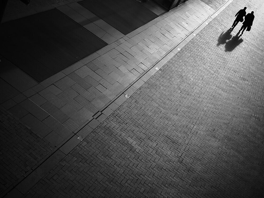
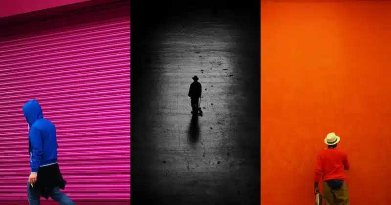
Photographers also understand the value of negative space. It can turn an ordinary shot into something extraordinary. By positioning the subject against a clean, uncluttered backdrop, negative space can enhance the visual impact of the image.
How to Use Negative Space
To effectively use negative space in your designs, consider the following tips:
- Plan ahead: Incorporate negative space as a deliberate part of your design process.
- Simplify: Remove unnecessary elements to create a cleaner composition.
- Experiment: Play with negative space and different layouts to find the most balanced and impactful design.
- Pay attention to typography: Adjust the spacing between letters and lines for readability.
- Keep it relevant: Ensure that the use of negative space enhances the message or story you want to convey.
Negative space is a silent hero in the world of design. It wields the power to enhance aesthetics, improve readability, and create visual impact. As a designer, understanding how to harness its potential can elevate your work to new heights. Whether you're working on a logo, a website, or a photograph, negative space is a tool you can use to captivate, guide, and simplify, ultimately creating designs that resonate with your audience. So, embrace the art of negative space, and let it breathe life into your creative expressions.
Here are some more examples:


