Essential Tips for Effective Design
In the world of design, typography is often the unsung hero. It's the silent force that influences how we perceive and understand visual content. The choice of fonts, their arrangement, and spacing all play a pivotal role in creating designs that are not just aesthetically pleasing but also effective in conveying messages. Here are some things you can do to help enhance your designs and start understanding typography and utilizing it more effectively.
1. Choose Fonts Wisely
The first step in mastering typography is selecting the right fonts for your project. Consider the following:
- Purpose: Different fonts convey different moods and are suitable for various purposes. A playful script font might be great for a children's book cover, but it might not work for a financial report.
- Readability: Ensure that your chosen font is easy to read. The legibility of the text is crucial, especially for longer pieces of content.
- Consistency: In most cases, it's best to limit your design to two or three fonts to maintain a cohesive look. Ensure that they complement each other.
2. Pay Attention to Hierarchy
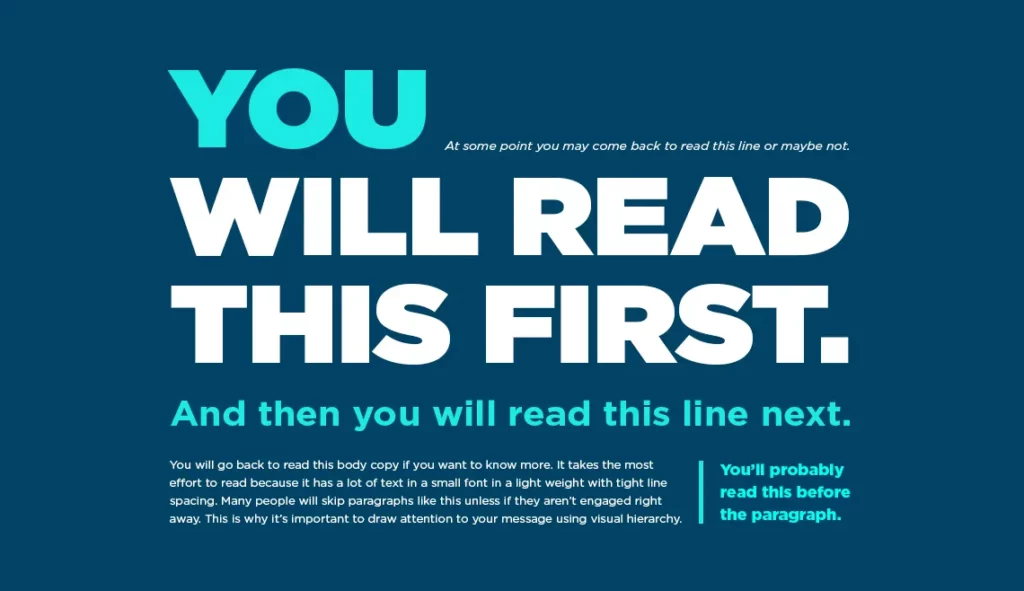
Typography can establish a hierarchy in your design, guiding the viewer's eye to the most critical elements. To create an effective hierarchy:
- Use different font sizes: Larger fonts naturally draw more attention.
- Alter weight and style: Bold, italics, or underlined text can indicate importance.
- Color: Using color can also help establish a hierarchy, with important text in a contrasting or bolder color.
3. Mind the Spacing
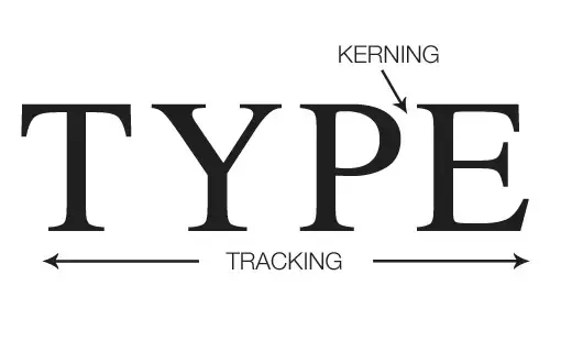
Proper spacing is crucial for legibility and aesthetics. Many fonts need adjustment, they are not always correct, especially free fonts that you might download here or there. Pay attention to:
- Kerning: (The space in between the letters) Adjust the space between individual characters to ensure even spacing and prevent awkward gaps.
- Tracking: This involves adjusting the overall spacing between groups of characters, words, or lines.
- Leading: (The space in between the sentences) Appropriate leading makes text easier to read.
4. Be Mindful of Alignment
The alignment of your text can significantly impact the overall feel of your design:
- Left-aligned: Provides a clean, organized look and is the most common alignment.
- Center-aligned: Creates a sense of balance and can work well for short headlines or quotes.
- Right-aligned: Less common but can be used effectively for specific design aesthetics.
- Justified: Text is aligned to both the left and right margins, creating a clean and formal look. However, it can sometimes result in uneven spacing.
5. Understand Your Audience
Consider the preferences and expectations of your target audience. What fonts and styles will resonate with them? For example, a young, trendy audience might appreciate modern, sleek fonts, while a more traditional audience might prefer classic serif fonts.
6. Test, Iterate, and Seek Feedback
Typography is both an art and a science, and what works best may vary from project to project. Always test your design, seek feedback, and be open to making adjustments. Sometimes, minor tweaks can make a significant difference in the overall impact of your design.
Always keep in mind: Typography is a fundamental aspect of design that should not be underestimated. By choosing fonts thoughtfully, establishing hierarchy, paying attention to spacing and alignment, understanding your audience, and being open to testing and feedback, you can master the art of typography. These tips will help you create designs that are not only visually appealing but also effectively communicate your message to your audience. Typography, when used skillfully, can transform good designs into outstanding ones, leaving a lasting impression on your viewers. So, embrace the power of typography and let it enhance your creative expression.
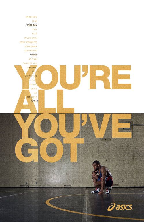
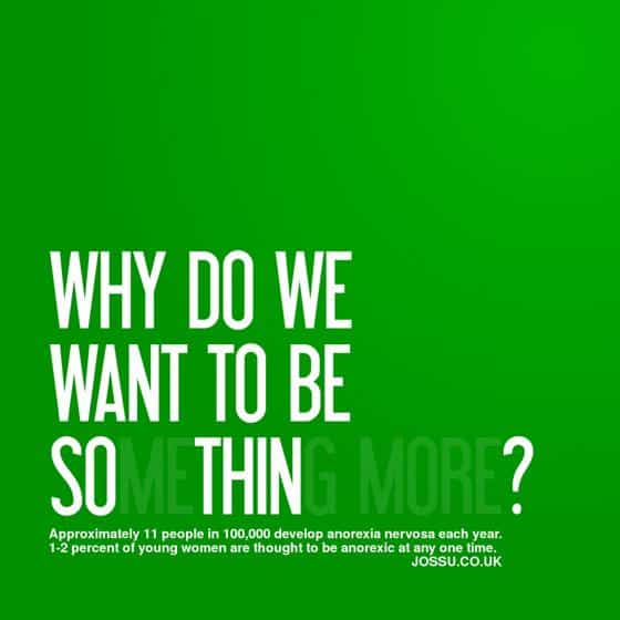
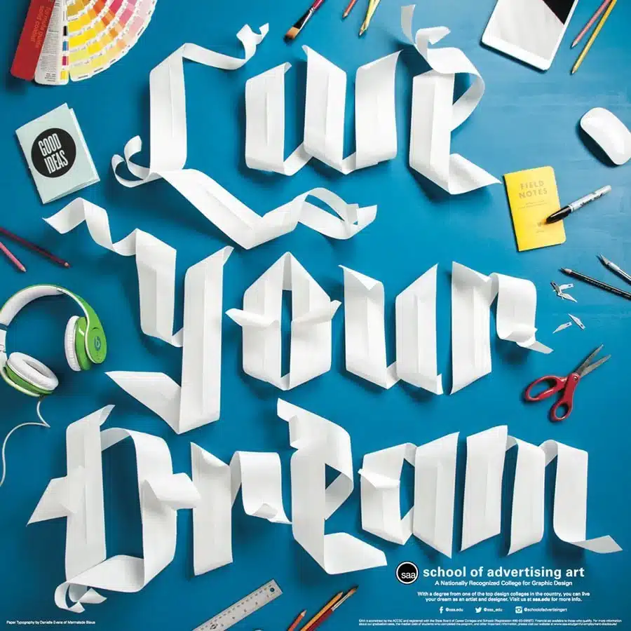
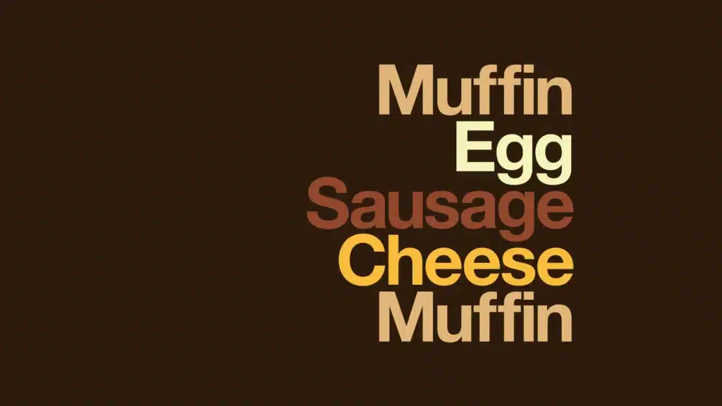
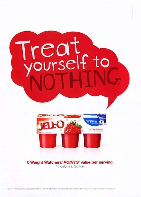
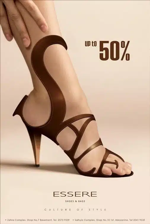
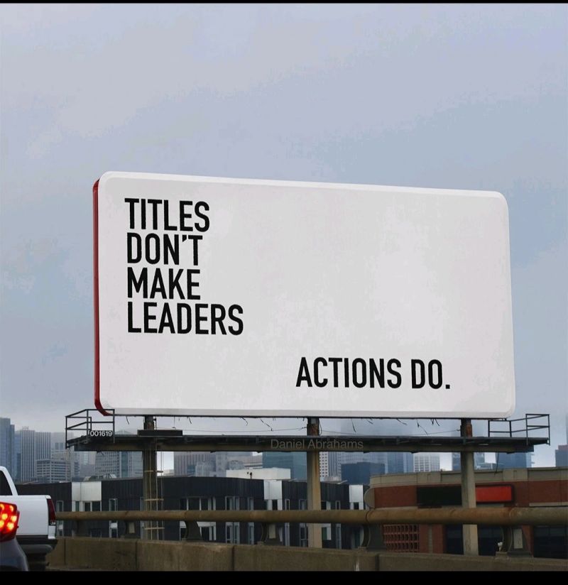
Here is some inspirado for you to view: